CSS Foundations: Style Your First Web Page - Web Development (Professional Practice)
14 hrs
$ 19.99
Modern Web Development Foundations - From Zero to Your First Interactive Website
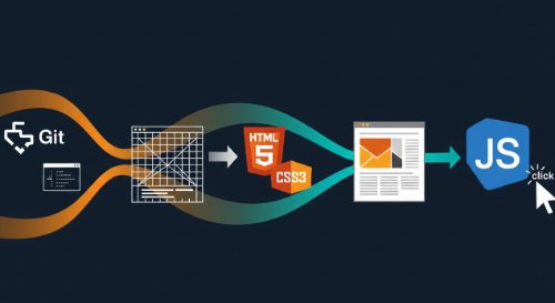
This is the direct path to building professional-grade web development skills. This learning track is a comprehensive programme covering the entire modern front-end stack, engineered to take you from zero knowledge to possessing a practical, portfolio-worthy skillset. It moves logically from foundational web concepts and professional tools, through structuring content with HTML5, styling with modern CSS, and finally, building dynamic user experiences with JavaScript.
This programme is built for individuals starting a career in technology with no prior coding experience. It is the essential curriculum for aspiring front-end developers, full-stack engineers, and computer science students. It also serves professionals in adjacent roles - such as UI/UX designers and product managers - who require a practical understanding of web technologies to excel in their careers.
By the end of this learning track, you will have the ability to build, style, and launch a fully interactive, responsive website from a blank file. You will master the professional developer's toolkit - Git, the command line, and an AI-assisted editor - and write clean, semantic code. This track provides the foundational project and technical skills to confidently begin your career path toward junior developer roles and to build robust personal or business projects.
Modern Web Development Foundations - From Zero to Your First Interactive Website
This is the direct path to building professional-grade web development skills. This learning track is a comprehensive programme covering the entire modern front-end stack, engineered to take you from zero knowledge to possessing a practical, portfolio-worthy skillset. It moves logically from foundational web concepts and professional tools, through structuring content with HTML5, styling with modern CSS, and finally, building dynamic user experiences with JavaScript. This programme is built for individuals starting a career in technology with no prior coding experience. It is the essential curriculum for aspiring front-end developers, full-stack engineers, and computer science students. It also serves professionals in adjacent roles - such as UI/UX designers and product managers - who require a practical understanding of web technologies to excel in their careers. By the end of this learning track, you will have the ability to build, style, and launch a fully interactive, responsive website from a blank file. You will master the professional developer's toolkit - Git, the command line, and an AI-assisted editor - and write clean, semantic code. This track provides the foundational project and technical skills to confidently begin your career path toward junior developer roles and to build robust personal or business projects.
Course Chapters